Welcome to Friday's addition of Club Scrap Creates!
It's Kay here and I've been enjoying the fun rubber stamps included in the Odds 'N Ends sale. Wow! Can you believe these prices?!?!
Simple but fun, I just put together this positive and negative card (depending on how you look at it) with the large Steppin' Out Stamp.
I added foam squares behind the stamped frame I cut out to add some dimension.
What a fun look with that nifty Steppin' Out collage stamp! I'm pretty sure I was inspired by someone who created this look in the past . . . I think it was over at Split Coast Stampers. The idea stuck with me until I finally had a chance to make it myself. Be sure to leave a comment below if that was you!
This cool dress form image from the Textiles & Notions Stamps gets me every time! My precious mom was a home ec teacher, and the set always brings back such fond memories of her.
I couldn't resist trimming out the dress form with a small sharp scissors and attaching it next to this Arts & Crafts quote on this card.
Isn't the window print from the Heart & Home 8.5x11 is a fun background for that card? :)
Steppin' Out strikes again. . .
The cute bowtie tutorial on this stamp makes a great background for my Anniversary Card, and the blue color mist ended up being a good touch also.
I hope you take advantage of this great sale with so much fun to be had. Thanks for stopping by. It's always great to see you here!
Kay From Club Scrap
Friday, September 28, 2012
Thursday, September 27, 2012
Digital 'Adhesive'
Happy Thursday, everyone! Ron from Club Scrap here with a new digital tutorial for you today.
We all know that paper crafters use a variety of adhesives for making layouts, cards and projects, but you don't normally think about digital crafters needing adhesive, right? Well, today we're going to look at one way to make digital 'adhesive tape' that can be used to add an interesting bit of embellishment to your digital pages and cards.
As always, I'm using Adobe Photoshop 5 to do this, but any program that supports layers should work for you - you may need to modify the steps to accommodate the particular program that you're using.
1. Create a new document, 12x12, 300 ppi, transparent background.
2. Open a background of your choice - I'm using one of the backgrounds from the September Club Scrap Digital™ Kit, Serenity.
3. Drag the background onto your new document (in Photoshop, if you hold the Shift key while you drag, the background will center itself in your new document). Once you drag the background over, you can close the background file.
4. Create a new layer on top of the background.
5. Magnify your layout to zero in on an area - this will help you better see what you're working on.
6. Using your marquee tool, create a rectangle that's about 2 inches long and 1/2 inch high.
7. Use the Fill command (Shift-F5) to fill the rectangle with the color white.
8. Deselect the rectangle (Command/CTRL-D).
9. Use the Polygonal Lasso tool to select a zig-zag area on 1 edge of the rectangle, then delete the selection.
10. Repeat step 9 on the other edge of the rectangle.
11. Reduce the opacity of the rectangle - try around 30% opacity, but this may vary depending on the color of your background.
12. Use the Layer Style Command to set Inner Shadow, Bevel & Emboss, and Drop Shadow, using the parameters shown below. This will add depth and realism to your piece of tape.
13. Place the 'tape' on the corner of a photo, rotating it as needed.
14. Make additional pieces of tape as needed for the other corners of the photo.
Tip: Make tape in different sizes and colors and save them all in a single PSD file to use as 'ready to go' elements. Experiment with different opacity, and Layer Style settings to vary the look of your tape pieces.
Hope you enjoyed this quick look at making and using your own digital adhesive! Now go and make something digital!
We all know that paper crafters use a variety of adhesives for making layouts, cards and projects, but you don't normally think about digital crafters needing adhesive, right? Well, today we're going to look at one way to make digital 'adhesive tape' that can be used to add an interesting bit of embellishment to your digital pages and cards.
As always, I'm using Adobe Photoshop 5 to do this, but any program that supports layers should work for you - you may need to modify the steps to accommodate the particular program that you're using.
1. Create a new document, 12x12, 300 ppi, transparent background.
2. Open a background of your choice - I'm using one of the backgrounds from the September Club Scrap Digital™ Kit, Serenity.
3. Drag the background onto your new document (in Photoshop, if you hold the Shift key while you drag, the background will center itself in your new document). Once you drag the background over, you can close the background file.
4. Create a new layer on top of the background.
5. Magnify your layout to zero in on an area - this will help you better see what you're working on.
6. Using your marquee tool, create a rectangle that's about 2 inches long and 1/2 inch high.
7. Use the Fill command (Shift-F5) to fill the rectangle with the color white.
8. Deselect the rectangle (Command/CTRL-D).
9. Use the Polygonal Lasso tool to select a zig-zag area on 1 edge of the rectangle, then delete the selection.
10. Repeat step 9 on the other edge of the rectangle.
11. Reduce the opacity of the rectangle - try around 30% opacity, but this may vary depending on the color of your background.
12. Use the Layer Style Command to set Inner Shadow, Bevel & Emboss, and Drop Shadow, using the parameters shown below. This will add depth and realism to your piece of tape.
 |
| Inner Shadow Settings |
 |
| Bevel & Emboss Settings |
 |
| Drop Shadow Settings |
13. Place the 'tape' on the corner of a photo, rotating it as needed.
14. Make additional pieces of tape as needed for the other corners of the photo.
Tip: Make tape in different sizes and colors and save them all in a single PSD file to use as 'ready to go' elements. Experiment with different opacity, and Layer Style settings to vary the look of your tape pieces.
Hope you enjoyed this quick look at making and using your own digital adhesive! Now go and make something digital!
Wednesday, September 26, 2012
Papercrafting...Crafting with Paper. Tomato, To"mah"to?
It was a happy day when I was contacted by CS and asked to be a Guest Blogger...how could I refuse?
I have the most wonderful memories of being part of early CS and made absolutely wonderful and life long friends from this crafty enterprise! I still laugh about being part of one of the earliest retreats and no one knowing quite who I was, ending up with just about an "all-nighter" of demonstrating inky techniques galore...you know who you are that were there!
In looking through what digital files I could get my hands on, I just sat and smiled going through many pics...here's a few!
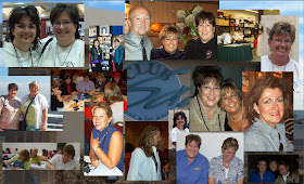 After 8 great years at Ranger, what could be crazier than inky overload in day to day work? Why not "crafting-in-all-categories" overload as Director of Education at A.C. Moore Arts & Crafts? Yeah, that'll do it. I've just celebrated my 4th anniversary with this East Coast retailer of 141 stores, with everything "content"...Make & Takes, Demonstrations, Crafty Events as well as Social Media (Facebook, Twitter and Pinterest for starters) as well as being the Media Representative on tv segments. Now my brain is in definite overdrive, but my love of papercrafting still resonates in the majority of projects I create for myself, friends and work.
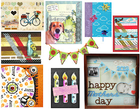 I thought I'd share some of what I've been making to provide some inspiration...the bottom line is that every technique you learn from Club Scrap or anywhere else (especially from your own experimenting), can always translate into something other than a card or scrapbook page; not that anything is wrong with that, but it's nice to sit in your home and to be able to readily see something that you've created become a piece of home decor for everyone to enjoy that YOU made!
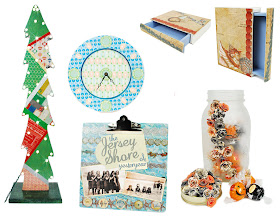 Here's some recent cards and true "papercrafting" projects created; most all instructions can be found here. As for the "crafting with paper" projects, some are not on the internet yet, but you can check back...just think how awesome some of these projects can be with CS paper?
I have the most wonderful memories of being part of early CS and made absolutely wonderful and life long friends from this crafty enterprise! I still laugh about being part of one of the earliest retreats and no one knowing quite who I was, ending up with just about an "all-nighter" of demonstrating inky techniques galore...you know who you are that were there!
In looking through what digital files I could get my hands on, I just sat and smiled going through many pics...here's a few!
 After 8 great years at Ranger, what could be crazier than inky overload in day to day work? Why not "crafting-in-all-categories" overload as Director of Education at A.C. Moore Arts & Crafts? Yeah, that'll do it. I've just celebrated my 4th anniversary with this East Coast retailer of 141 stores, with everything "content"...Make & Takes, Demonstrations, Crafty Events as well as Social Media (Facebook, Twitter and Pinterest for starters) as well as being the Media Representative on tv segments. Now my brain is in definite overdrive, but my love of papercrafting still resonates in the majority of projects I create for myself, friends and work.
  I thought I'd share some of what I've been making to provide some inspiration...the bottom line is that every technique you learn from Club Scrap or anywhere else (especially from your own experimenting), can always translate into something other than a card or scrapbook page; not that anything is wrong with that, but it's nice to sit in your home and to be able to readily see something that you've created become a piece of home decor for everyone to enjoy that YOU made!
 Here's some recent cards and true "papercrafting" projects created; most all instructions can be found here. As for the "crafting with paper" projects, some are not on the internet yet, but you can check back...just think how awesome some of these projects can be with CS paper?
The bottom line is...have fun, don't be afraid to experiment in ideas you have (you might be surprised as to what you can do!) and take the time to make stuff!!!
Wishing you all the most fun in your papercrafting adventures! Robin
Tuesday, September 25, 2012
Serenity Shutter Box Project Video
Hey, Bloggers . . . Tricia here!
Once a month, Kay and I duck into the studio and create the Club Stamp Project together. It's always a good time. Sometimes we start having so much fun that Kay forgets to snap the picture!
We take tons of step out photos, and I always say, "Better to have too many than not enough."
Armed with more than seventy pictures, I started to write the instructions for the Serenity Club Stamp project. We were able to narrow it down to a mere 33 steps! The aim is to write steps that are clear, concise and brief supported by a photo that tells the story.
But a video just tells it so much better.
Even with agressive editing, the video didn't make it under YouTube's fifteen minute limit, so you'll find it hosted on Vimeo.
You can pick up the full Club Stamp kit or the "nekkid" components in the GHM! Dept. And don't forget the Bookbinding Glue!
Here's the video. We hope it helps make this project even more fun! (More fun than that heartbreaking loss against Seattle last night.)
Friday, September 21, 2012
Digital Card Trick
Happy Friday, everyone! Ron from Club Scrap here today to perform some slight of digital hand with a card trick!
Last week I showed you how you can make your Facebook and email birthday wishes really stand out by using a digital card. Today, I'll show you how that digital card can serve double-duty by becoming a hybrid card! And using your digital kit goodies to created a printed card helps you get more mileage out of your paper kits, too - we don't wanna be running out of CS paper now, do we?
Here's the digital card that I've chosen to work with:
I made it using Just Dandy - one of my favorite Club Scrap® kits (I know I say that a lot, but that's only 'cuz so many of them ARE my favorites!).
(I'll be using Photoshop 5.5 to create my hybrid card, but any program that supports layers should work just fine.)
1. Create a document that measures 8.5 x 11 with a white background, 300 ppi.
2. Drag all the layers from your card PSD file onto the new 8.5 x 11 document.
3. Determine if there are some 'complex' shapes that you won't want to 'fussy' cut - you'll need to leave those shapes on a piece that will be easier to cut out (or you may opt to just leave that item off your final design completely).
4. Remove all layer styles and delete any custom drop shadow layers that you created when the original card was designed - note: if you're leaving any complex shapes layered on top of other shapes, it's a good idea to leave the complex shape drop shadows in place.
5. Move the individual layers around on your 8.5 x 11 document so that there's no overlapping - you'll be printing and cutting these pieces out, so leave a bit of space between each item, and leave enough space in the margins so that things don't get cut off by your printer. I opted to cut out the dandelion, but printed an extra copy just in case I needed it!
Note: I normally elect to not include the base 'paper' from my digital card. instead, I'll use a coordinating sheet of CS paper cut to size as the card base and just use the rest of the pieces from the card.
6. Save your file (this way you can print out more copies later and make more cards!).
7. Print out the file on CS® Basics White card stock.
8. Cut out the individual pieces.
9. Ink the edges - it adds some extra interest and hides the white edge of the paper.
10. Assemble your card, using your original digital card as a reference for where things go. Use pop dots to add dimension. You can also opt to use real ribbon rather than the paper ribbon and you can add other embellies from your stash if you'd like.
Here's the finished hybrid card:
Now, wasn't that easy? I hope you found this helpful for yet another way to use those wonderful digital cards!
Thursday, September 20, 2012
Stitching In Memories
Thursday greetings from Kay at Club Scrap here,
With the great Textiles & Notions flash sale going on today, I just had to get my hands on at least a couple sheets of Textiles and Notions paper and make this layout. I used the 8.5x11 Purple Print to start it off, and went from there.
The collection has such a warm feeling to it that I thought I would use it for this picture of my Dad meeting his first great grandson for the first time.
I wanted to add at least a little of each of the fun colors available from this collection throughout the layout.
The patterned translucent looks so cool torn for this double matte around my 4x6 photo.
I couldn't let the layout be finished with out adding the Textiles & Notions stenciled envelope for adding the journaling.
It's such a fun collection with a great color palette and sewing notions designs! and at an awesome sale price!! I must do more pages now!
Thanks for stopping by,
Kay of Club Scrap
Wednesday, September 19, 2012
Serentity with a Flip
Pat Huntoon here. I am thrilled to be a guest blogger today! I am a huge Club Scrap fan. I started my membership in June 2002, four months before I even started the Technique Junkie Newsletter! Scrapbooking has always been my first passion, and Club Scrap makes it easy to create beautiful pages and albums with ease. Plus, with stamps and accessories that match perfectly, is is easy to Stampbook.
When I first opened the beautiful September kit, Serenity, I was struck by the, well, serene colors and the wonderful accessories, die cuts and stamps. The kit reminded me of the marsh my in-laws live on in Savannah, so I decided to make my Mother-in-law a mini-album celebrating one of our trips to their Savannah home.
I made a Pocket Flip Album, which uses 5 pieces of 12 x 12" paper and one piece of 8 1/2" x 11" paper. The Album is one of the 35 pdf tutorials from the Technique Junkie Newsletter Mini Album Mania CD. You can download the pdf for the Pocket Flip Album HERE.
That little album at the top of the page? It opens to it's full glory like this:
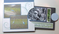
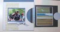
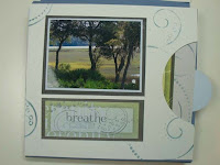
And it has additional pockets for more pictures and journaling, too! Every section you see above has an area that closes, with more areas on the opposite sides for additional pictures and art. Here are some more views of the album. Click on any picture to enlarge:


Believe it or not, there are even MORE views of this album! Not only that, but I have PLENTY of paper left in my kit for so many more pages and/or albums.
Now the moment of truth comes...can I bear to part with the album to give it to my mother-in-law?
Thank you, Club Scrap, for allowing me to show my album, and for continuing to produce such a beautiful product year after year. I am a lifelong fan!
Pat Huntoon
Tuesday, September 18, 2012
For the Love of Leaves
The fall equinox is on Saturday. And if you're from 'round these Midwestern parts, that means fresh apple cider, fresh cheese curds (they go with any season), crisp mornings, droppin' leaves and fall colors.
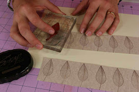
In honor of fall, I wanted to remind you of this nifty Jumpin' Leaves card. You may have missed it last year, and that would be a bad thing. Grab your Comfort Zone Unmounted Stamps and a few other simple tools. (Scoring tool or bone folder, CS® Grid Ruler, Comfort Zone paper, craft knife, CS® Earth ink and cutting mat.)
Here are the steps in written form:
1. Score a 4-1/4x11" sheet horizontally every 1-3/8". Cut the scored sheet vertically at 2-1/8". Stamp the unmounted leaf image onto each scored section with CS® Earth ink.
2. Place a grid ruler 1" from the bottom edge of a stamped strip and cut a slit between each stamped leaf. Repeat for the second strip.
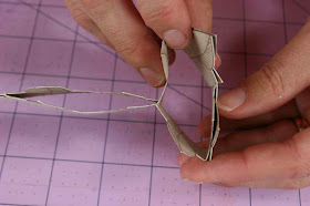
3. Cut out the tip of each leaf with a craft knife, starting at the horizontal cut line. Stamp the leaf image on the back of each trimmed leaf. Use a craft knife to cut a 1/2" slit from the bottom edge of the first, third and fifth score lines of one strip. Cut a 1/2" slit from the top of the first third and fifth score lines of the second strip.
4. Interlock the corresponding slits to weave the two paper strips together. Pull apart the pairs of leaves on the score lines to create the pop-up. Adhere to each side of a folded card.
You and I both know that a video is worth a billion words. And it's SO much easier for me to show you than it is to explain! I know, right?
I'll bet you're just jumpin' outta your seat right now and on your way to go make this. Now, don't forget the cheese curds.
Tricia


