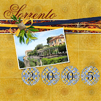
Every month, your Club Scrap Digital™ kit includes an Alpha set - individual PNG files for the letters of the alphabet, numbers, and usually some punctuation. I often get so excited about the backgrounds and fibers, Xtras and stamp images that are part of the kit, that I often overlook the Alphas, so I thought it might be a good idea to chat about them today and give you some ideas about how to use them in your layouts. And the Alphas in this month's Sorrento kit are just perfect!
The Sorrento Alphas are very ornate and, at first glance, you might be thinking "Gee, what's the best way to use these in a layout?" Well, because they are so ornate, I think "Less is More" is really the way to go here. And keep them fairly big - they can certainly be a focal point on your layout - use one to start a quote, 2 or 3 as a monogram, or 4 to include the year on your page.
I started with a fairly simple digital layout - 1 photo with a banner cluster to anchor the photo and 'Sorrento' as a title above the banner. Then I added the year using the alphas (I merged the 4 numbers into a single layer and and tucked it under the photo for a bit more interest). All of these samples were done using Adobe Photoshop 5, any steps provided are for Photoshop 5. If you use a different program, check the Menus, Help Screens, or Documentation for similar options.
 |
| Layout with 'basic' Alphas |
 |
| Layer Styles |
Now the fun begins! Let's apply some simple Layer Styles to the date to change the look. Layer Styles can be found at the top of the Layers Palette. (Layer styles modify the selected layer in different ways, using the colors in the layer below, so your results may be different, depending on the colors & patterns that are under the layer you're working on.) Just select the layer you want to apply the style to, and pick the style from the drop down list.
First up, the Linear Burn - on this fairly light background, the Linear Burn is quite a bit darker, but it also picks up some of the colors in the background:
 |
| Linear Burn Layer Style |
Next, let's see what happens if we use the Color Burn instead - not quite as dark, and definitely more of the orange (from the background) is evident:
 |
| Color Burn Layer Style |
While on the Color Burn, I decided to take it one step further - I added the Alpha "S" just above the background, made it quite large, gave it a Color Burn layer style and then reduced the opacity (using the opacity slider in the Layer Palette) to blend it in to the background. And here's what it looks like:
 |
| Color Burn Monogram in the Background |
The next thing I tried was a two-step process - first, use the Invert command (Image -> Adjustments -> Invert; or Ctrl-I using Windows, Command-I on the Mac) to reverse the colors in the date layer, then I applied an Overlay Layer style. It really lightens up the date and highlights the yellows and oranges from the background. (I also added a drop shadow just to make the date 'pop' a bit more.)
And the last thing I tried had nothing to do with layer styles, Instead, I used the Hue/Saturation command (Image -> Adjustments -> Hue/Saturation; or Ctrl-U using Windows, Command-U on the Mac) to recolor only the number part of the Alpha.
 |
| Image -> Adjustments Menu |
I hope these examples have give you some ideas on what you can do with Alphas (and frankly, pretty much any other digital item in your arsenal) to change up your layouts. Don't be afraid to play - digital scrapping is VERY forgiving! If you don't like the results, you can always use the Undo command and start over (and you have an endless supply of digital elements so you'll never run out!). And if there are any other digital topics you'd like me to talk about, please leave a comment and let me know - I'm always looking for new topics to blog about!!!
And if you haven't tried Club Scrap Digital™ yet, what are you waiting for? Click here to buy a digital kit and start playing!


Thanks for this great digi tutorial Ron!
ReplyDeleteI learn all kinds of neat tricks from you, Ron. Thanks!
ReplyDeleteOh Ron, this is great!
ReplyDelete