Happy Friday! Ron here with another digital tutorial. This one is the result of a request from my good friend and CS Member, Julie Heyer! Julie and I were chatting the other day and she said, "You know what I'd like to see a tutorial on? How do you make something like a paper clip look like it's attached to a photo or something in an digital layout?" So that's what I'm going to show you today - how to 'snip a clip' - well, at least I'm going to show you how I do it - as with most things digi, there are usually a few different ways to accomplish things!
This technique works great for layouts (as illustrated in the tutorial below), but it's great on cards, too! Use it to 'attach' your sentiment to a fiber or other parts on the front or your card! And since Saturday is World Cardmaking Day, check out these other posts on digital and hybrid cardmaking: Digital Greetings & Facebook and Digital Card Trick. Okay, on to the tutorial...
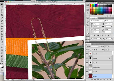
1. Start your layout as you normally would - I've got a layout with a background and some fibers (from October's Peacock kit - the fibers have been recolored), and I've added a photo.
2. Add your paper clip in a new layer.
3. Position the clip so that it's where you want it in the final layout - I've place mine (this one is from Club Scrap's Apothecary Kit) in the upper left corner of the photo, at a slight angle so that it will be clipping the photo to the orange fiber.
4. Select the clip layer and lower the opacity so that you can still see the paper clip, but you can also see the fiber and photo 'through' the clip. Around 50% should work, but your setting may vary based on the elements that you're using. Lowering the opacity helps you see where you need to snip the part of the paper clip that will be behind the fiber.
5. Decide which part of the clip you want to erase - I'm going to remove the inner part of the paper clip.
6. Choose the Polygonal Lasso Tool from the tool bar.
7. Select the part of the clip to remove (it may help to magnify that portion of the layout so that you can more easily select the right part).
8. Press the Delete key.
9. Raise the opacity of the clip layer back up to 100%.
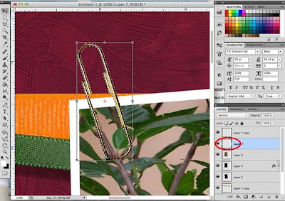
10. Duplicate the clip layer.
11. Click on the thumbnail of the original clip layer (the lower one) while holding down the CTRL (Windows) or Command (Mac) key. This will select the just the object in the layer.
12. Use the Fill command (Shift-F5) and select Black. This will make the lower clip black in color.
Next, we'll turn this onto a drop shadow for the clip.
13. Click and hold the lower center handle of the graphic and drag down slightly. Then click and drag the upper center handle and drag down a bit as well.
14. From the Edit menu, select Transform -> Skew.
15. Click and hold the lower center handle of the graphic and drag to the right slightly.
16. From the Filter menu, select Blur -> Gaussian Blur.
17. Choose a setting around 3. Tip: The closer the object is to the background it's near, the lower the setting should be. If an item is floating farther away from the background, choose a higher setting.
18. Reduce the opacity of the shadow layer. This is very subjective - the closer an item is to the background, the darker the shadow usually is. Pay attention to objects in real life and see how dark or light certain shadows look to get a feel for what setting you want to use. For this example, i'm using an opacity of 47%.
We're almost done! just one last thing to do!
19. Select the polygonal Lasso Tool and select the little bit of shadow that's 'peeking' down from where you removed part of the paper clip - in real life, that part of the clip is behind the fiber and doesn't cast a shadow. Once it's selected, press the Delete key.
That's it! now you've created a layout with a photo that looks like it's paper-clipped to the fiber and it's got a realistic drop shadow to complete the effect! Not difficult at all when you know how. Just takes a few minutes and about 19 steps to accomplish!
Okay, go try it out for yourself! And if there's something else you'd like to see in a digital tutorial, just ask - post a comment her, in the digital forum in the CS Coffeehouse, or send an email to me at ronp317@mac.com. I'm always looking for blog post ideas!!


Ron, You totally rock! Thanks so much and I know that I can definitely handle this fun look now. Can't wait to learn more with upcoming lessons.
ReplyDelete:)
Wowza. . . . I think I'm gonna have to try that with two windows open--my Photoshop Elements AND the blog steps. But I love how you've got it stepped out here. I'll bet I can do it!
ReplyDeletelove that Ron! Thanks for sharing! I'll have to give it a try.
ReplyDeleteA suggestion for moving that drop shadow: When you only want something to move a small amount, try using the keyboard arrows. This may provide better control than trying to move it manually, especially for anyone with shakey hands.
ReplyDeleteGreat suggestion!
Delete