 |
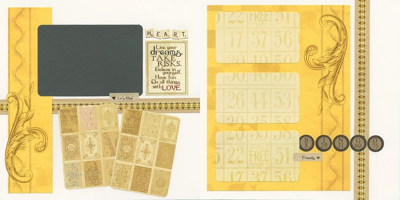
| Rounding the corners of the 2.5x3.5" Grey mattes adds a nice playing card look. I really love my Corner Chomper! |
 |
| The photo mattes and journaling areas fit together like a puzzle. Remember to attach the elements with even spacing for a great look. |
 |
| The long, narrow mattes on the right are perfect for landscape images. If you lack horizontal photos, add two smaller squares to each matte. |
 |
| I love the neutral tones in this pair of pages. You'll be surprised by how many themes it will support! |
 |
| Note that the edge of the Yellow Print on the left has been trimmed away to add dimension to the cool swirl and border. |
 |
| Reaching the end of the process with a well-balanced page always makes my day. Wrapping a corner of the Grey mattes with satin ribbon adds a nice finishing touch. |
 |
| The A2-sized cards this month are double-scored to form an easel. They include two sets of double panels for the outside and inside. |
I could go on an on, but you will find more details about each card in the instructions. Enjoy being as creative as you like with these gems!
Tricia


I really like the cheerful colors in this kit - especially the yellow and gray combo! I agree that the rounded corners really add to the overall look of the layouts.
ReplyDeleteLOVE IT ALL!! Can't wait to get it!
ReplyDeleteVery cool Tricia - as always you hit the nail on the head with everything.
ReplyDeleteStupid 1st on a Saturday! (Anxiously awaiting mine!)
ReplyDeleteLoving these easel cards! Waiting for this sunshine to arrive in my mailbox. It will help to provide some warmth for my cold and snow covered city. Thanks, Tricia!
ReplyDeleteI wasn't sure I'd like the colors from the sneak peek, but the prints totally rock it! So very clever and classy-fun! Nice job CS!
ReplyDeleteBeth M
Great LOs and cards! Waiting for it to arrive.
ReplyDeleteI really like this kit's colors too. Bright, but muted enough. Love the gray and yellow combo!
ReplyDeleteThese cards are AWESOME!!! Love them all!
ReplyDeleteLove them! Can't wait to get my hands on them!
ReplyDelete