Showing posts with label Get the Picture. Show all posts

Friday, August 22, 2014

Cinema Greetings to Go Guest Artist

I am excited to be your guest artist this month. The Cinema collection really captures my style. I love everything about this collection: the richness of the color palette and materials, the classic images in the art work, and the distinctive sentiments. I had a great time integrating digital elements, applying techniques and making interactive cards.

Set A: 4" x 9¼" Cards


This card idea popped into my mind as soon as I saw the sentiment. It is so true! In fact, I had to hide this piece of bubble wrap from my family. I used a couple of cardstock circles and piece of acetate to stabilize the bubble wrap, along with the silver brad to allow it to swivel.


The front panel was created using stamps from the Cinema Borders & Backgrounds and Art Nouveau inked with Lagoon CS Hybrid Ink on a white panel. Afterwards, I heat set the ink and brushed over the paper with Tumbled Glass Distress Stain. It gives a brushed look on the glossy paper that I'll call the "glossy staining technique." The background on the inside panel is Ash CS Hybrid Ink on a bubble stencil. I inked the edges with Black Soot Distress Ink.


Movies are such a part of everyday life and everyone has their favorites. I pulled out some of my favorite classic movie quotes and the Cinema digital collection to make the front panel. The fonts used in the kit can be found in the blog post on the first of each month.


Together with a digital background and movie reel overlay, I printed the quotes onto white cardstock. I added the flap closure since I could not bear to cover any part of the quotes. The sentiment is stamped onto a Stampin' Up punched panel with the glossy staining technique (described above).


I love exploring the cutaparts and extra little goodies added to the embellishment package. This card is a waterfall card made with cutapart squares and the 1 mm silver tape. The background is a white panel colored with Lindy's Stamp Gang Magical (powered mica paint) in Sweet Violet Purple Teal with images stamped in Lagoon and Ash CS Hybrid Ink.


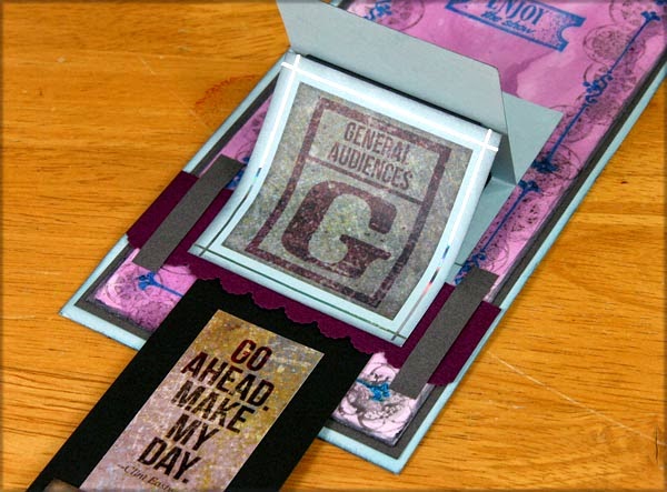

I embellished the pull-out with more cutaparts and a glassine envelope embossed with the Tin Tiles embossing folder. The tab at the top includes Martha Stewart Deco Fan and EK Success Scalloped Scallop punched edges.


What classic cinema is complete without rich velvet curtains?


I made the curtains from a Splitcoaststampers tutorial for window blinds. The base is a white panel colored with Orchid CS Hybrid Ink direct to paper, then colored with Distress Black Soot Stain. The ribbon is from the Tin Tiles collection. The header is the Deco Tassel punch from Martha Stewart. The greeting is a cutapart matted with plain papers.


For this card, I just accentuated the elements provided in the Greetings to Go kit. I inked the white panel with CS Hybrid ink in Orchid and Ash. I added silver 1 mm tape to the reels and Ranger Holographic embossing power to the "lighted" section. White flowers from my stash were colored with Lindy's Stamp Gang Magical in Sweet Violet Purple Teal.


Embossing Folder Leaves: 


This technique is a new favorite! Fold a scrap of Aqua Print in half (the fold becomes the center vein of the leaf). Use the CS Picnic Thin Lines embossing folder to add lines at a 45 degree angle to the fold. While still folded, use a portion of a circle punch to create the basic leaf shape. Cut out a curve at one end to create the leaf "tip."  Ink the edges and center seam. Pinch to add dimension.


Set B: 4 ¼" x 5 ½" Cards


My go-to source for inspiration is the CS member forum challenges. The Monthly Card Sketch challenge is my favorite! Not only do you get a sketch, but members submit many different interpretations of the same concept. As a bonus, I usually have most of the supplies on hand. This month's card sketch is a wonderful CAS (clean and simple) card from Marya. I liked it so much I made two cards using it.


The border strip was created by inking the CS Geometrics Stencil and heat embossing Lindy's Stamp Gang Sliver Moon Turquoise. Next, the film strip (Border & Backgrounds) and star images (Art Nouveau) were stamped in CS Hybrid Ink in Orchid and Lagoon. Finally, the whole strip was clear-embossed using Versamark Dazzle. To echo the border strip, the sentiment was stamped in Orchid and heat embossed with both Sliver Moon Turquoise and Versamark Dazzle.


This card is my horizontal version of the challenge sketch. The background was made using several Lindy's Stamp Gang sprays, sprinkled heavily with kosher salt: Glory of the Seas Gold, Silent Night Silver, Time Travel Teal, and Mission Bells Brown. (Actually, I accidentally added more salt than I originally wanted, but I left it alone to dry and was pleasantly surprised by the results!) The border strip is Aqua Plain embossed with the Tin Tiles Embossing Folder, brushed with a light layer of gesso and sprayed with Lindy's Stamp Gang Glory of the Seas Gold mist. The greeting is white embossed ink with mini star brads from my stash.


This card resulted from an experiment with a new product, WOW! Melt-It powder, and a new art medium, Izink, a very fluid acrylic-based pigment ink. The button-like embellishment is a combination of Melt-It powder and WOW! Violet pearl embossing powder. The mixture was heated and poured into a Martha Stewart silicon mold.

The background was made with Izink in four steps:
  1. Apply silver Izink through the Get The Picture masking stencil onto mixed media paper.
  2. Clear emboss the projector image (Collection UM) over the stenciled area.
  3. Drip Turquoise, Topaz, and Opaline Izinks randomly over the background. Blend with water spray and damp towel.
  4. A mixture of Opaline and Geranium Izinks was added to the edges.
I finished the card with 1 mm black tape lines, matting, and black and white ribbon. The sentiment was colored using the glossy staining technique over Orchid Hybrid Ink and Tumbled Glass Distress Stain, finished with final layer of Brushed Pewter Distress Stain.


The marker board focal image (Collection UM) was heat-embossed in white on black cardstock. The popcorn (Border & Backgrounds) and ticket images (Collection UM) were stamped on white glossy paper and heat set. The popcorn was colored with Scattered Straw and the ticket with Tumbled Glass Distress Stain.


Elements from the Cinema Digital Collection were used to create this card. The photograph is my husband's restoration project, a '71 Mercury Cougar Convertible, combined with a digital mask. I printed the picture and mustache ribbon on silver paper. The greeting was stamped in Black India ink and colored with Tumbled Glass Distress Marker.

Set C: 4 ½ x 6 ¼ Cards


For this card, I wanted a simple night sky. Stars from a Cape Cod unmounted were embossed with CS Hematite embossing powder. I used a light layer of Lindy's Stamp Gang Starburst Silent Night Silver brushed on and then covered with gloss gel medium in a light coat t
o give a shiny texture to the sky. A larger star was embossed with Lindy Stamp Gang Silver Moon Turquoise to make it stand out. The large stars are silver foil cut with the Sizzix Stars #2 die.


The "I'm ready for my close up" sentiment spoke to me of formal occasions like a graduation or a wedding. I made the dress from the aqua paper embossed with, you guessed it, the Tin Tiles embossing folder. It was lightly painted with gesso and sprayed with Lindy's Stamp Gang Starburst Glory of the Seas Gold mist. I cut the dress freehand and added the Martha Stewart Eyelet Lace punch along the hem. Mini pearls from the Bookshelves kit and 1 mm gold tape dressed it up. The waistband is twisted sheer wine ribbon. The background foil was made using the Tin Tiles Embossing Folder.


The cutapart film strip had such a lovely shape that I cut it out for the edge of this card and accented it with gold 1 mm tape. I mixed embossing powers for the speckled background: CS Hematite, Gold UTEE, and Lindy's Stamp Gang Silver Moon Turquoise. The "Celebrate" tag has a ribbon tab and was tucked into a glassine envelope. 


The "Congratulations" cutapart made me think of graduation. I used this Splitcoaststampers tutorial to make a building blocks card. 


I scaled the letters and numbers from the digital collection to fit the pop-ups. A few stamps, ribbon, and foil stars from the Sizzix Stars #2 die complete the design.
  

This is my "trash to treasure" card. I experimented with many techniques, but not everything worked out as planned. Some of those elements found new life on this card.


  • The star background embossed in CS Hematite has only one panel since I embossed the image upside-down on the other side.
  • The bottom layer was from an experiment with embossing powder over texture paste. It had a cool effect, but was too "heavy" to use for a whole card base.
  • The brighter blue strip was heat embossed with Lindy's Stamp Gang Hydrangea Blue Moon through the Geometrics Stencil from above, but the color did not work for that particular card.
  • The white block is a glassine envelope embossed with the Tin Tiles embossing folder. It became too delicate to use as an envelope.
  • The car image was the first one I printed in black, but it was too dark on the silver paper.
  • The rest is a collage of leftover die cut stars and ribbon pieces.
The result is a masculine birthday card. I'm so glad I didn't clean my desk until I was all done!


Happy Crafting,

Debby H
Masculine Inspirations in Paper & Crafts


Elements from the Cinema Club Scrap Kit, digital collection, and Borders & Backgrounds stamps were used in addition to the supplies I was provided as Guest Artist.

*******************

Guest Artists are provided with the following materials from the current monthly kit:

  • Greetings to Go Pack
  • Embellishment Pack
  • Collection Unmounted Rubber Stamp sheet
  • Greeting Unmounted Rubber Stamp sheet
  • Art Nouveau Unmounted Rubber Stamp sheet
  • Extra 8.5 x 11" plain papers from the monthly kit

The artist may also choose to incorporate items from their own craft stash, as well as different inks and art mediums. We do our best to make note these additions in the card descriptions whenever possible.

Thursday, April 25, 2013

Photo Color Swatch Challenge

My friend Jac Carney, designer extrodinaire here at Club Scrap, just posted a new challenge on the Club Scrap forum. You can read all about it HERE. I thought this idea was really cool, so I decided to play along.

It all started with a photo from 500px.com. Here’s one of the first photos I saw there: http://500px.com/photo/31676911

I not only love the colors, but the overall look of the photo., so I decided to incorporate that photo’s ‘feeling,’ too. I was in one of those ‘artsy’ moods.  I wanted to create something digitally that didn’t look like a typical layout. So I grabbed a photo of a windmill, and two digital backgrounds . . . one from Club Scrap’s Get the Picture collection and the other from Solstice (November 2009’s monthly kit). And I started playing.

I enlarged the photo, blurred it and reduced the opacity so that the Get the Picture background would show through. Then I layered the Solstice background over the right half of the layout and reduced the opacity to get that greenish-yellow glow. I mimicked the broken glass feel with a stamp image of some random text (sorry, not sure which kit it came from, I found it in my brush files!).

Finally, I added the word ‘tranquility’ in white and gave it an overlay style to blend it into the layout a bit.

The result - an artsy looking layout that's cool enough to frame:

I like this challenge ‘cuz it makes me think differently about what I create . And it reminds me that inspiration can come from all sorts of places. So head on over to 500px.com and choose a photo. Then create something wonderful and share it in the challenge thread HERE.

I can’t wait to see what you come up with!


-Ron

Thursday, April 18, 2013

Digital 'Die Cuts'

I love die cuts! I own 1 manual and 3 electronic die cut machines and hundreds of dies & cartridges for those machines! But the truth is that lately, I do more digital crafting than paper crafting. So, I got to thinking, can you mimic the look of die cuts in Photoshop?

Duh! Of course you can! And it’s easy! (no really, it IS easy!)

Lemme show you…

1. Start with a digital stamp image. Bold images tend to work better, but don’t be afraid to experiment - you may be pleasantly surprised with the results. I’m using the ‘Viewmaster’ stamp from the Club Scrap Digital™ 'Get the Picture' Collection.


2. Grab a digital background - this will become your ‘paper’ for the die cut.
3. Place the stamp in a layer above the background.
4. Click on the stamp layer’s thumbnail in the Layers Palette. You’l see ‘marching ants’ around the stamp image.

5. Hide the stamp layer by clicking on that layer’s ‘eye’ icon in the Layers Palette.
6. Click on the background layer to make it active.
7. Choose ‘Inverse’ from the Select menu.
8. Press the ‘Delete’ key. you’re left with a ‘cut out’ of the image.

But, it’s a little flat looking. Let’s apply a bit of digi magic to make it look like a die cut.

1. Choose ‘Deselect’ from the Select menu (Ctrl-D on a PC, Command-D on a Mac); this will get rid of the ‘marching ants.’
2. Click on the ‘Layer Style’ button at the bottom of the Layers Palette (the button has ‘fx’ on it).
3. Choose Inner Shadow from the Style pop-up.
4. Apply these settings:

5. Click on the Bevel & Emboss Style and apple these settings:

6. Click OK.

You’ve now given the cut out an ever so slight ‘thickness’ so that it looks like a piece of die cut card stock. See, that wasn’t hard at all!

You can also add a bit of a drop shadow if you’d like, but not too much, since your ‘die cut’ will probably be sitting rather close to the background.

Here are 2 more examples:
From the Bright Lights, Big City Kit

It works with sentiment stamps, too!

So there you have it - an easy way to mimic die-cuts in your digital crafting! Now off you go - give it a try and create something wonderful with your digital ‘die cut.’

Thanks for stopping by.


-Ron

Thursday, April 4, 2013

Did You Get the Picture?

Ron here with a ‘sort-of’ sneak peek this Thursday. If you participated in this year’s Winter PSL, you might have already seen the Get the Picture collection. If not, be warned - there’s a digi-spoiler or two in this post! But don’t worry, everyone will be able to get the paper and/or digi kit tomorrow!

I know I’ve said this before, but . . . I love this kit. Seriously. It’s so neutral. Perfect for any photos ‘cuz it’s a photo theme! And it’s grungy and dark. My kit of kits, for sure.

I decided to start with a layout using a few photos from my first CS Retreat in 2010.


Cool, huh?

Next, I was inspired by Tricia’s blog post from earlier this week. When I saw what she did with the masking stencil, I thought “I can do that with digi stuff.” So I did. I started with one of the digi backgrounds instead of coloring a white panel, and used that uber-cool ‘Viewmaster’ stamp as the masking stencil. I chose a ‘heavy oil’ brush and swiped a light beige color across using the stencil technique that I covered in THIS blog post, added a stamped sentiment, layered it on a couple of other pieces of background ‘paper’ and within minutes had a nifty digital card.


Just a couple of ideas of what you can create with this amazing kit. Now, go create something wonderful of your own and share it with someone special!