Showing posts with label Sorrento. Show all posts

Monday, August 26, 2013

Pattern Basics Layouts

Good Monday Morning everyone!

I attended iClassy Girl's (aka Tiare Smith's) online August Pajama Party where she featured this months very cool Tribal Kit in her layout. She provided this sketch and gave us ingredients we would need to participate in a live video tutorial broadcast. I decided to watch and chat this time around, but knew that I wanted to create my own layouts using this great sketch.

Tiare's August PJ Party Sketch
With the sketch in hand, I took out my Pattern Basics Brights papers, 4 photos, two 4.25x4.25" purple & two 4.25x4.25" shimmer blue photo mats from the 2011 Papillon kit and two sheets of 12x12 white textured cardstock from the 2009 Solstice kit.

Here are the 2 layouts that I created.
Sun die cut using Silhouette SD.
Flower die cut using Tim Holtz Tattered florals Sizzix die.
Smallest flower center punched using small sun punch and pearl from stash. 

Special thanks to Tiare for hosting the event and providing this fun sketch!

I used the Sorrento Font Art Stamp set using CS Amethyst Hybrid Ink for both titles. I hand wrote portions of the title and journalling in Distress Marker (Spiced Marmalade and Faded Jeans) using the fine tip end.

Hope you will stop by and watch the taped version of Tiare's broadcast.* It just might inspire you to make some layouts of your own. Or, better yet, join her next month for her September PJ Party. I hope to see you all there.

Hope you have a fantastic week!

Julie


*if you are not a member of SpreeCast it will require you to sign up.

Monday, August 19, 2013

August 2013 Card Sketch with Freebie!

Good Monday Morning!
August 2013 Card Sketch

So happy to be back after my wonderfully creative weekend with my friends at the Annual August Club Scrap Retreat. We had a blast and NO I will not be posting any spoilers, you all will just have to wait until after the October Retreat and Retreat in a Box 2013 ships. All I can say is that it was an amazing time and I really wish I could go back and do it all again in October.

Back to the blog at hand. I always feel so inspired after returning from Retreat. I spent Saturday afternoon playing with my homemade glimmer mists from Retreat in a Box 2012. I had helped Tricia by testing different formulas in preparation for this Creative Concoctions workshop. So much fun!
I created a background paper using the mists, my Sorrento mask and stamps to match my 2 other cardstock colors. I chose a light blue from Cyprus (Sept. 2008 kit)  and a lime green from Comics (Feb. 2011 kit).
Create a background paper on white cardstock using the
Sorrento (July 2012 kit) mask and homemade glimmer mists.
*Member Lynn Borders Tip: clean off your mask directly onto an
untouched area of your artwork to create more layers of color and masking.

I love creating for the many challenges at the Club Scrap forum. One of my favorites is the Card Sketch Challenge hosted by the talented Jen Rodgers. She has been hosting this fun challenge for 2 years. We will miss her as she has decided to give up the reins hosting this popular challenge beginning next month. I created a free ALCM (Assembly Line CardMaking) set of cutting instructions based on the August sketch.  Enjoy!

ALCM freebie
Here are the steps I used to create 3 cards.
Stamp Sorrento UM stamp images in black on your masked background paper.
Cut all 3 pieces of cardstock following the ALCM instructions.
Ink the edges of all of your pieces using black ink.
Punch shapes out of the 2.25x3.5" scraps
using your favorite punch (Fiskars flower).
Punch centers using remaining cardstock and a tiny sun punch.
Layer alternating cardstocks of sun centers and flowers.
Add flowers to cards using a black pop dot.
Finished cards with added adhesive rhinestones from stash.
Sentiment - July 2012 Sorrento kit
Thanks so much for stopping by and hope you enjoy the freebie.
Don't forget to share your Club Scrap artwork with us in our GALLERY.
And if you are not a member of our Forum, then what are you waiting for?
Come and join in the fun! Click on this LINK to register.

Have a great week!
Julie

Tuesday, December 11, 2012

A Big, Fat Book of Wine

I admit to enjoying a lovely glass of wine now 'n then. Cab Sav, Sauv Blanc, Pinot Noir, Pinot Grigio, and even a buttery Chardonnay now 'n then. You?

Ever since we released our Uncorked Collection Unmounted stamps, I've had a vision for this little wine tasting journal.

I finally decided to make one. I think I might give it as a Christmas gift to my wine buddy, Scott Carney, if I can part with it. Scott knows way more about wine than I do, so he'd take far better tasting notes in this journal.


Tricia's Notes: Gee, this one is tasty. Buy this again.
Scott's Notes: Lovely vintage, but could use a year or two of aging. Spicy finish with nice tannins.

I am mere grasshopper understudy to the great sommelier that is Scott Carney.

OK. Sorry. Back to the "book of wine". I love this project. I really do. I loved every minute of making it. Except punching the holes. Not a fun job.

Supplies:
Uncorked Unmounted Stamps
(4) pkg. Gimme a Ring Drop a Line Journaling Cards (Plain Side)
Sorrento Newsprint Thickers
Sorrento and Equestrian Fibers
(6) 12x12 Sheets All That Jazz Dark Brown Print (seconds)
(2) 3-3/8x4" Matte Board
8.5x11 Sorrento Ginger Print
Crop-A-Dile
(2) 2" Binding Rings
CS® Bookbinding Glue
Foam Brush
Bone Folder
12" Paper Trimmer
CS® Earth and India Black Inks
CS® Grid Ruler

1. Stamp the unmounted "tasting notes" image onto the back of each journaling card with Earth ink.

2. Trim each 12x12 Dark Brown Print into nine 3.25x3.75" pieces. (Trim at 11.25, 7.5 and 3.75". Cut each 3.75x12 horizontally at 9.75, 6.5 and 3.25".) Nest one journaling card onto the right edge of a panel. Center the grid ruler onto the panel, 1/4" from the left edge. Mark holes for punching at center, and 1.25" above and below center. Punch holes.

3. Trim the 8.5x11 Sorrento Ginger Print vertically at 6". Trim the 6x11 horizontally at 5.5". Cut the 2.5x11 horizontally at 6.5 and 3.25". (This will create two 5.5x6" outside covers and two 2.5x3.25" inside covers.) Glue the matte boards to the center of the outside covers.

4. Mitre the corners and wrap the flaps. Glue the inside covers in place. (For a great tutorial on this process, please watch this Essentials Video on wrapping!)

5. Place the punched inside page onto the inside back cover with the left edge of the page flush with the left edge of the cover. Mark the location of the holes onto the cover and punch.

6. Transfer the location of the holes on the back covers onto the front cover and punch.

7. Transfer punched holes to all of the panels and attach the journaling cards. Thread the covers and journaling pages onto the binding rings. Decorate the front cover with those adorable newsprint Thickers featured in the Sorrento JR kit.

8. I added a few extra pages to the book to be used as dividers for "reds," "whites," and "other" categories.

8. Tie a bunch of ribbon and fiber onto the rings. Yummy!

So, should I keep it? Or should I hand it off to the winemaster. Decisions, decisions.


Cheers!
Tricia

Thursday, July 12, 2012

3-Step Digital Layout

As many of you know, Club Scrap® Summer Camp started this week (and if you don't know about Summer Camp, click here to learn about it!). Karen Wyngaard and I are the Counselors for this year's digital cabins. So I thought this might be a nice time to show everyone a quick 3-step digital layout. It's an easy way to make a layout, even if you're new to digital scrapping. And If you want to add some journalling, I've got an optional 4th step for ya, too! Even with 4 steps, we're still talkin' easy-peasy!

One of the great things about the monthly Club Scrap Digital™ kits are the clusters - these are ready-made embellishments that include custom shadows to make your digital layouts really shine! And sometimes, 1 or 2 of those clusters include frames - it's those frame clusters that allow us to make a really cool layout in 3 (or 4) steps! So let's get started…

(My layout was made using Adobe Photoshop 5; if you're using a different program, adjust your steps accordingly - but this is a very basic layout which doesn't use a lot of fancy steps!)

To get started, open a new document - 12" x 12", 300 ppi, transparent background. Make sure you've selected the Pointer tool from the Tool palette.

1. Pick a background for your layout and drag it onto your new document. (In Photoshop, if you hold down the Shift key while you drag, the background will automatically center itself in your new document.) I'm using a background from July's Sorrento Kit.

First, place your background.

2. Open your desired photo and drag it onto the background (don't worry about where to position the photo yet).
Next, add a photo.

3. Open your frame cluster and drag it onto the background. I picked a frame cluster from Just Dandy. (Yeah, that's right - I'm mixing kits, but don't they look great together?!)

Then, add a Frame Cluster.

Now you can resize your photo so that it fits the frame - click and hold one of the corners and drag to make your photo larger or smaller, as needed. Hold the Shift key to retain the photo's proportions while you resize. Press 'Enter' to accept your changes. Depending on the frame cluster that you chose, you may need to rotate your photo - hover your cursor near one of the corners of the photo until you see the curved arrows - then click and drag to rotate the photo as needed. Press 'Enter' to accept your changes. If you want to move your photo & cluster on the page, just be sure to select both layers in the layers palette and reposition as desired.

Finished Basic 3-Step Layout
You're done! Now wasn't that easy?

Okay, if you want to add some journalling, here's a quick way to do that:

4. Select the Text tool (it's a capital 'T') in the Tool palette, click anywhere on your layout and type your title or journalling (photoshop will automatically create a new layer for your text). Change the font, size, and color as desired. Repeat if you want to add more text to your layout.

Done! Here's my finished layout:

Finished Layout with optional Text

Now it's your turn - make a layout (for PSL or just for yourself).

And here's a surprise - Tricia's on vacation this week, so we're havin' a bit of extra fun while she's gone - post a comment (by Friday, July 13th 12 Noon CS time) and tell me what you love about Club Scrap Digital™ and 1 lucky winner (chosen at random) will get a special digi prize!

Friday, July 6, 2012

From the Park to the Pencils

Warm Summer Greetings to you!

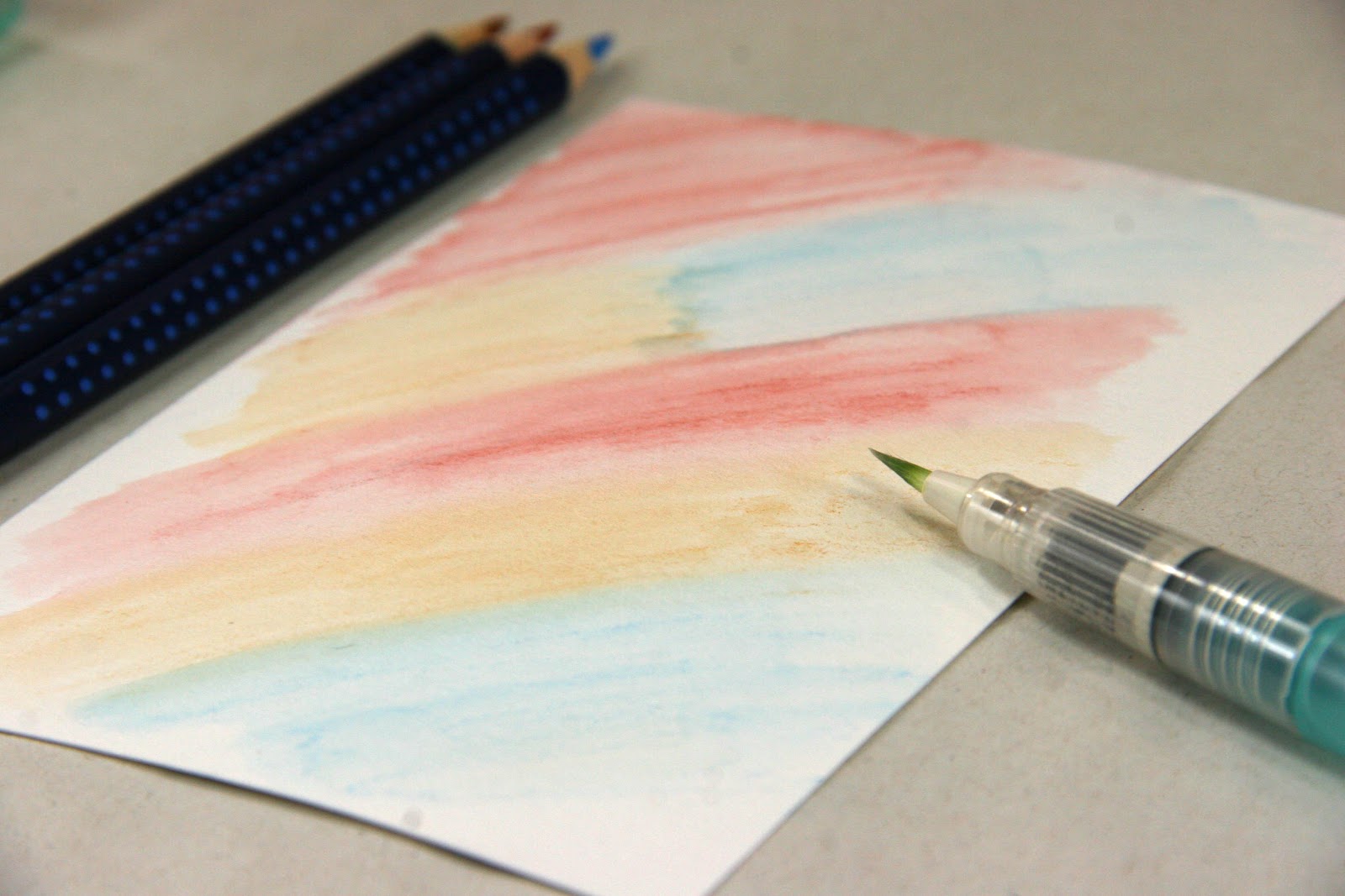
After spending the 4th of July at a Wisconsin Dells water park with my family, I thought, "Why not go Full Circle with the water theme in my card making today?" So I pulled out my Full Circle Aquarelle Watercolor pencils by Faber-Castell, which really coordinate nicely with July's great Sorrento Collection, and let the watercolor fun begin.
I began by stamping a Sorrento Unmounted Borders & Backgrounds image and quote with Staz On ink. This ink won't bleed when I use the watercolor brush. (You can also use Club Scrap's India Black ink as a base for watercoloring, as well. It's my "go-to" pad, but this was closer.)
I simply started coloring. Don't you just love to color? There is something relaxing and soothing about going back to the basics.
A waterbrush or little paint brush dipped in water works well for blending the colors. It only takes a little bit of water to make the colors come alive.
After cutting out the watercolored images, I attached them to my 5x7 card front. (Oh, and you can make it look like you have several different images by cutting larger and smaller portions of the circle.)
The watercolor pencils and water brush together will also create fun little color splatters, this is always a cool touch if you ask me.
So, I had to make more than one while I was at it!

This time I used those same watercolor pencils for a background wash instead of coloring the stamped image like I did above.
Same watercolor pencils, different look.
Just like being at the waterpark, it's a very carefree technique. I just colored the card front...
...and added water. The result? A cool color washed backdrop.
This color washed background was so easy to stamp on and embellish. I used my new favorite Sorrento "Happy Birthday To You" greeting and the Sorrento Transparency to finish off this card.
I'm so ready for next month's Birthday Card Swap!
Now thinking I'll squeeze another trip to the water park in soon!

Stay cool and thanks for stopping by Club Scrap Creates!
Kay Williamson of Club Scrap

Thursday, July 5, 2012

Alpha Antics: Playing with Digital Alphas

Since I'm primarily a digital scrapper, I thought it would be appropriate to talk about some digital techniques today. Don't get me wrong, I'll never give up paper - and with Club Scrap® I don't have to - I can get paper and digital kits every month!

Every month, your Club Scrap Digital™ kit includes an Alpha set - individual PNG files for the letters of the alphabet, numbers, and usually some punctuation. I often get so excited about the backgrounds and fibers, Xtras and stamp images that are part of the kit, that I often overlook the Alphas, so I thought it might be a good idea to chat about them today and give you some ideas about how to use them in your layouts. And the Alphas in this month's Sorrento kit are just perfect!

The Sorrento Alphas are very ornate and, at first glance, you might be thinking "Gee, what's the best way to use these in a layout?" Well, because they are so ornate, I think "Less is More" is really the way to go here. And keep them fairly big - they can certainly be a focal point on your layout - use one to start a quote, 2 or 3 as a monogram, or 4 to include the year on your page.

I started with a fairly simple digital layout - 1 photo with a banner cluster to anchor the photo and 'Sorrento' as a title above the banner. Then I added the year using the alphas (I merged the 4 numbers into a single layer and and tucked it under the photo for a bit more interest). All of these samples were done using Adobe Photoshop 5, any steps provided are for Photoshop 5. If you use a different program, check the Menus, Help Screens, or Documentation for similar options.

Layout with 'basic' Alphas
Layer Styles


Now the fun begins! Let's apply some simple Layer Styles to the date to change the look. Layer Styles can be found at the top of the Layers Palette. (Layer styles modify the selected layer in different ways, using the colors in the layer below, so your results may be different, depending on the colors & patterns that are under the layer you're working on.) Just select the layer you want to apply the style to, and pick the style from the drop down list.


First up, the Linear Burn - on this fairly light background, the Linear Burn is quite a bit darker, but it also picks up some of the colors in the background:


Linear Burn Layer Style


Next, let's see what happens if we use the Color Burn instead - not quite as dark, and definitely more of the orange (from the background) is evident:


Color Burn Layer Style


While on the Color Burn, I decided to take it one step further - I added the Alpha "S" just above the background, made it quite large, gave it a Color Burn layer style and then reduced the opacity (using the opacity slider in the Layer Palette) to blend it in to the background. And here's what it looks like:

Color Burn Monogram in the Background


The next thing I tried was a two-step process - first, use the Invert command (Image -> Adjustments -> Invert; or Ctrl-I using Windows, Command-I on the Mac) to reverse the colors in the date layer, then I applied an Overlay Layer style. It really lightens up the date and highlights the yellows and oranges from the background. (I also added a drop shadow just to make the date 'pop' a bit more.)


And the last thing I tried had nothing to do with layer styles, Instead, I used the Hue/Saturation command (Image -> Adjustments -> Hue/Saturation; or Ctrl-U using Windows, Command-U on the Mac) to recolor only the number part of the Alpha.


Image -> Adjustments Menu
Start by selecting the Magic Wand tool from your tools Palette and make sure 'Contiguous' is checked of in the top bar - this will insure that you only select the number and not the rest of the alpha graphic. then click on the '2' - you'll see the 'marching ants' dotted line appear around the 2. Holding the Shift key, click on the remaining numbers '0' '0' and '5' - now all the numbers are surrounded by the 'marching ants.' Select the Hue/Saturation command and in the dialog box that opens click the 'Recolor' box then adjust each of the the sliders until you get a color that you like. (It does take some playing with all 3 - Hue, Saturation, and Lightness, but you can always click 'Cancel' and start again if you don't like the results!). I used a dark background for this sample, because it really made the alphas stand out. But experiment with different colors, both light & dark and see which ones you like best.


I hope these examples have give you some ideas on what you can do with Alphas (and frankly, pretty much any other digital item in your arsenal) to change up your layouts. Don't be afraid to play - digital scrapping is VERY forgiving! If you don't like the results, you can always use the Undo command and start over (and you have an endless supply of digital elements so you'll never run out!). And if there are any other digital topics you'd like me to talk about, please leave a comment and let me know - I'm always looking for new topics to blog about!!!

And if you haven't tried Club Scrap Digital™ yet, what are you waiting for? Click here to buy a digital kit and start playing!